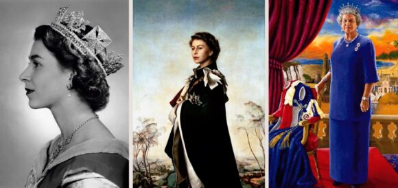
According to the National Portrait Gallery, the Queen is ‘the most portrayed individual in history’. It’s an extraordinary statistic. Think of all the history-changing individuals Elizabeth II has out-portrayed – Julius Caesar, Napoleon, Adolf Hitler, Chairman Mao, Marilyn Monroe.
The reasons why there are so many portrayals of her are many and varied. Her longevity has obviously been crucial. As we press our lips to the trumpets and toot our 70 platinum toots most of us will have lived our entire lives within her reign. The Queen has bookended our existence. She’s always been there.
Yet portraits are not like the rings of a tree, each marking another year of growth. Portraits are the result of a process that has more in common with alchemy than with maths. Some of the extraordinary plenitude of the Queen’s imagery is the result of her vintage — but much of it is not. Much of it has happened for whispery, elusive, diaphanous reasons.
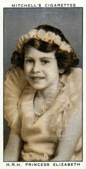
Since she was a small girl, beaming from the cigarette cards pressed into the British fag packet by WD & HO Wills, the camera has loved the Queen. At first it was that Shirley Temple thing she had. As a child she oozed a bouncy blonde confidence. Especially when Princess Margaret was in the shot as well and Elizabeth could adopt the presence of a mildly bossy elder sister.
Yet it was in her princess years, when the cherub of the cigarette cards blossomed into the seriously beautiful heir to the throne, that things really started to heat up between the Queen and the camera. Sociologists, historians and cynics will tell you that these were already years of exponential growth in the image industry — new magazines, new cameras, a new interest in the new. As an entity, the royal family had become actively aware of the need to present a fresh image of itself to its populace. Not just in Britain, but in every corner of the huge pink empire it ruled.
It’s all true. Everybody loves a princess. But any old princess would not have emitted the powerful gamma rays that Elizabeth Alexandra Mary Windsor emitted when she sat down for the first time in front of Yousuf Karsh, photographer of the famous, and began the series of potent portrayals that chart the climactic stages of her princessdom.
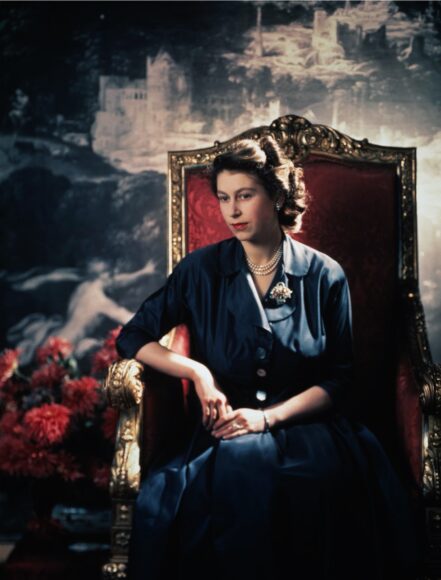
What Karsh realised immediately is that this particular princess could have been a film star. The line of her neck. The precise bunching of her hair, carefully parted, but with a hint of noirish unruliness. The society photographer Dorothy Wilding saw it too. It was one of Wilding’s perfect royal profiles, taken immediately after the accession in 1952, that became the image repeated on our national stamps.
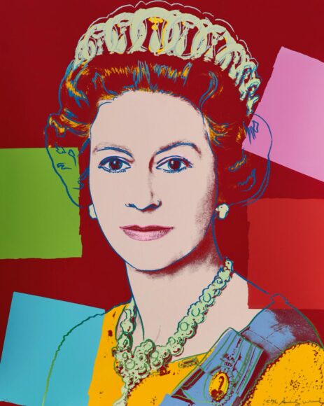
Later still, Andy Warhol used one of the official state likenesses of her as the basis for a brightly iconic royal screenprint. From the start, Elizabeth Windsor had something about her that lenses go giddy over.
So, yes, the camera loved the Queen. But — and this is where it gets slippery — she evidently loved it back. This is not the right occasion for us to begin nosing about in the enclosed garden of royal coquettishness, but, as an art critic, it’s as clear to me as the daylight in a painting by Christen Kobke that as a young woman, Elizabeth knew what she had and was never entirely shy about putting it out there. She could smoulder. She could do the half-smile thing. She could look back at us alluringly over a naked shoulder.
The photographer who recognised this most precisely was Cecil Beaton. It started when he was telephoned out of the blue by Buckingham Palace. At the time, the years before and after the Coronation, he was the world’s best known fashion photographer. But a fashion photographer is not a royal photographer. Hiring him was an independent and pointed thing for the Queen to do.
With his rococo details, cascading cloths and bountiful bouquets, Beaton gave the postwar world the fairytale princess it desired. When she became Queen the regalia changed, but not the mood. For him she was always a monarch of the Cinderella dynasty. What Beaton knew from the start, with his fashion training, is that a supermodel had ascended to the British throne.
I have met her only once, while making a film about the art in the Royal Collection. Invited for tea at Buckingham Palace, I was struck by her complexion. She was in her seventies, but her face was as smooth as a piece of Meissen porcelain. Her eyes — butterfly blue at the centre, snow white at the edges — still looked new, as if they had just come out of a Harrods box.
So the most portrayed individual in history has had an impressive photographic reign. What, though, of the other artistic territories? What about her portrayal in the most significant of all artistic substances — paint? That, unfortunately, is another story.
The English monarchy has a decent record when it comes to commissioning paintings of itself. Henry VIII showed true perspicacity when he made Hans Holbein his court artist. It was Holbein who invented the extra-wide monarch without whom the Tudor industry of today would have had no monster to imagine. Elizabeth I may never have found a Holbein, but she did control a Tudor image machine that pumped out highly effective presentations of her as the Virgin Queen. Even as bad a king as George IV showed superior artistic taste when he got in Sir Thomas Lawrence to paint him.
The second Elizabeth has, alas, presided over a downturn in this story. Most of the painters she has turned to have come from that bleak institution: the Establishment School of Untalented Lackeys. The results have been bad likenesses or very uninteresting ones. The fashionable Italian Pietro Annigoni had perhaps the best go in 1955 when he painted the recently crowned monarch in a traditional manner — the post, post, post-Renaissance style. The results were close enough to one of Beaton’s royal photographs to remain charming. Just.
Deeper into her reign Annigoni would fail dismally in an attempt to add a note of maturity to the image of the Queen with his 1969 portrait of her as some sort of human rocket waiting to be launched from Cape Canaveral. In an effort to make her look maturely caped, he makes her look silly.
At some point in this catalogue of failure someone at the Palace seems to have persuaded the Queen to be more adventurous because who should pop up in 2000 to have a go but Lucian Freud, the Mr Dissolution of British painting? Freud was a brave choice. But also a disastrous one. His tiny portrait, not much bigger than one of Her Majesty’s postage stamps, makes her look like an old lady from a care home who has sneaked into Woolies and nicked a plastic crown. (The Sunday Times was not granted permission from the Royal Collection Trust to reproduce the picture.)
The one British artist who might have risen to the task of producing a portrait of the Queen that added something meaningful to the royal picture parade — David Hockney — has refused the challenge. Asked about it at the last jubilee, in 2012, he said he didn’t have the time and, besides, “I generally only paint people I know”. Thus Elizabeth II’s platinum reign has produced no painted portrait that can be pointed to as a great royal image. The photography of her early years is packed with achievement. The paintings that follow are relentlessly disappointing.
What happened, I think, is that the confidence and charisma of the princess years were brushed aside by a Palace strategy that demanded a more humble, less privileged royal portraiture. In an effort to ingratiate themselves with the Joneses, the Windsors began to downplay their aristocracy.
Thus the royal image shifted from one that might decorate the title page of Debrett’s to one that could go on the front of a Saturday section. Indeed, one of the few genuinely endearing likenesses of Elizabeth II from her later years is Peter Blake’s Diamond Jubilee one, commissioned especially for the cover of the Radio Times.
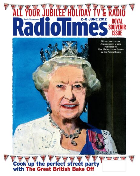
In it, she wears the same sparkling diadem that she wears on our stamps. Around her neck hangs a cluster of serious white bling, which goes with her white dress and her snowy white hair. The blue of her garter sash seems to rhyme with her eyes. The ones I remember.
What makes the portrait, though, is the beautiful smile that lights up her face. It has obviously been sourced from a photograph. But the artist has enlarged it into something touching. That’s what paint can do.