Helen Frankenthaler (1928-2011) is one of those artists you encounter frequently on the printed page but rarely in the flesh. At least in Britain. As the famed inventor of “color field” painting, she occupies an important perch on the American abstraction ladder. But that’s over there.
Over here she’s a shadow. There’s a shortage of her work on display. And because color field abstraction has been chronically unfashionable for pretty much the whole of my working life as a critic, there has been next to no chance to come to any firm conclusions about her.
So I entered the surprising Frankenthaler exhibition that has popped up at Dulwich Picture Gallery full of hope and interest. Alas, the hopes were soon dashed and the interest quickly sated. Dear me, but Frankenthaler is an arrogant and irritating presence.
Color field abstraction was a style that developed out of abstract expressionism in the late 1950s. Characterised by large patches of floaty and imprecise colour, it was, above all, a change of mood.
Where abstract expressionism was feisty, emotional and active, color field abstraction was slow and poetic. It ranked delicacy over drama, quietude over noise. If abstract expressionism was Beethoven, color field abstraction was Erik Satie. Plinky. Plonky. Seriously sensitive.
Dulwich Picture Gallery is a treasure trove of old masters — Rembrandt, Rubens, Van Dyck — so the arrival of floaty abstraction here is already unlikely. But by focusing on a very particular area of Frankenthaler’s output — her woodcuts — the organisers of this strange event have managed to widen that disconnect into something spectacular.
Woodcutting is a precise method. In the hands of its masters — Dürer, Cranach, the German expressionists — it resulted in art that was firm in its outlines and definite in its moods. The sheer hardness of wood, the crispness of the lines it leaves behind when you print from it, made it a medium that suited the clear thinker and the direct speaker. Frankenthaler is neither of those.
Her first woodcut was made in 1973. It’s on show in the opening room: a pale blob of beige ringed with slivers of black, blue, red and green. Produced with eight separate blocks of wood and printed on handmade Nepalese paper, it oozes fragility and sensitivity, but delivers almost nothing in the way of a memorable image.
The opening room has ambitions to precis her woodcutting career and includes various examples from her 30-year battle with the medium: it’s like watching a matador tame a bull and then kill it. Most of her effort goes into denying the natural firmness of wood by scratching and gouging into its surfaces with a variety of tools including a cheese grater — a process for which she invented the word “guzzying”.
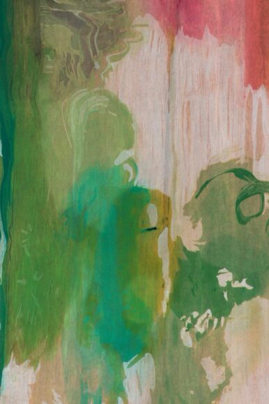
She also began splattering it with blobs of mashed-up coloured paper — handmade, of course — which took away all traces of the hardness and resulted in images that swirl and pulse in un-woodcutty ways and seem always to be seeking the imprecision that characterises her paintings.
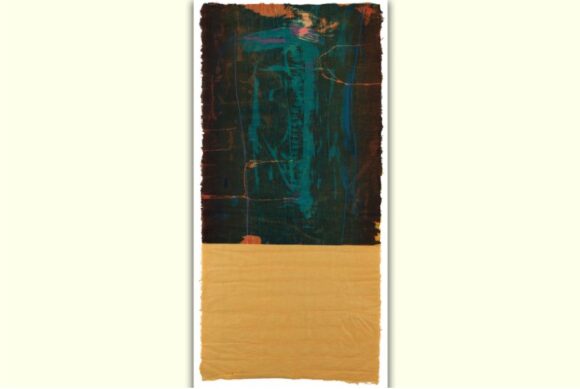
The process culminates in Freefall, a work from 1993 made from “21 Philippine ribbon mahogany plywood blocks on hand-dyed paper in 15 colours”. I’m not sure what the natural qualities are of Philippine ribbon mahogany, but I am sure that they play no part in the final image, a big drench of blue framed with jagged black shapes that look as if they have been torn from the cover of a notebook.
Given the crazy complexity of the methods employed here, the display does a decent job of explaining what’s going on. Indeed, for art geeks such as myself who enjoy the technical aspects of image-making there is much to delve into. Frankenthaler was clearly a world-class control freak in the printing studio and much of her creative energy went into prodding the large cast that was needed to make these complicated products into doing her exact bidding.
An image called Essence Mulberry, inspired by the colour of the mulberry juice produced by a tree outside her printer’s studio, is shown alongside half a dozen of the many proofs that went into perfecting it. One of them is annotated with Frankenthaler’s itchy instructions to her printer. “This does not bother me,” she writes next to a tiny sliver of blue that has accidentally crept across the border of a brown. “Don’t allow mulberry to hit the paper edge,” she scribbles in another corner where the red and the brown have mixed.
The problem here is not the instruction itself — of course any artist worth their salt must exercise complete control of the image-making — but a sense that all this attention to the trees is a way of compensating for losing sight of the wood. Most of the final images in this show are simply not worth the enormous communal effort that went into producing them.
What we have here, therefore, is an exhibition-long go at transforming the woodcut into something it has never previously been. From the start Frankenthaler’s energies go into changing the mood of the medium, challenging its DNA, going against its, er, grain.
You can see that as a heroic effort, or you can see it as a pointless one. I am now in the second camp.
Helen Frankenthaler: Radical Beauty, Dulwich Picture Gallery, London SE21, until Apr 18