Remind me never again to judge an exhibition by its title. I went into Monochrome: Painting in Black and White, at the National Gallery, expecting to be confronted by a collection of monochromes painted in black and white. And I can’t say my heart squealed with delight at the thought. But what I actually encountered was a madcap journey through art, full of clever pictures layered with deeper meanings, studded with impressive loans and culminating in one of the most intense colour experiences I have had in a gallery. Monochrome: Painting in Black and White? You’re having a laugh.
What is true is that at various moments in art’s past, for various reasons, various artists have limited their palettes in various ways. Almost never have they actually painted in black and white. But there has been some keen reaching for greys and browns. And what’s really welcome here is how these monastic moments take us in surprising directions. Rather than identify an urge to reduce, what this show does is awaken your eyes.
It also handily encapsulates art history. We start with two exquisite bits of French gothic — some stained glass; a leaf from an illuminated manuscript — in which the deliberate limiting of colour has a religious significance. In the gothic age, the deliberate draining of colour was a way of signifying another realm: the realm of the sacred. The beautiful little scene of St Catherine’s martyrdom in a 14th-century Bruges manuscript is painted in greys and whites because it is a holy event taking place in a holy space.
The grey world also had a specific connection with death, especially the death of Christ. That is why a gorgeous Nativity by Petrus Christus, borrowed from the National Gallery of Art in Washington, has a full-colour Christmas scene at its centre — Mary, Joseph, the baby Jesus, some singing angels — framed by an illusionistic gothic arch carved with sinful incidents from our biblical past. Cain murders Abel. Adam and Eve are expelled from paradise. And at the bottom of the sinful arch, carrying it on their backs, bent double at the effort, are a pair of angry munchkins raging at the prospect of holding up the sins of their fathers for eternity. I think they are meant to represent us.
I’m a lover of Flemish art and its guilt-inducing symbolism, so excuse my dalliance with Petrus Christus. It mustn’t give you the wrong impression. This is not a show devoted chiefly to Old Master issues. Indeed, who should pop up in the second room but Picasso, represented by one of his high-speed reworkings of Velazquez’s Las Meninas, produced in 1957? I guess they couldn’t get Guernica.
Picasso painted in monochrome at regular intervals. With Guernica, he wanted to set a mood with the colours of the cemetery. But with the reworked Velazquez, he’s merely having fun, Picasso-style, riffing cheekily on the pictorial implications of the big white dress worn by Velazquez’s famous infanta. A couple of pictures later, Giacometti, who painted almost exclusively in browns and greys, gives us a figure so slight, she’s barely there: a faraway woman reduced to her vibrations.
Artists worked with a restricted palette for many reasons. It’s a point the show keeps making. Dürer painted a Dutch woman from the back in monochrome so that he could give the folds in her cloak a miraculous solidity. Without the distraction of colour, he could concentrate on the way that light fell on the drooping cloth and shaped it.
Titian, on the other hand, included a white marble relief of the sitter in his fabulous portrait of La Schiavona — one picture, two portrayals: once as a painting, once as a sculpture — because he was seeking to involve himself in a silly Renaissance argument that had broken out between painters and sculptors. The Renaissance clearly had a lot of time on its hands when it began wasting intellectual energy on this pointless turf war. What Titian is doing in La Schiavona is proving that a painter can imitate the effects of sculpture, but a sculptor can never imitate the effects of painting. So painting wins.
Thus Monochrome, to an extent that completely surprised me, turns out to be a show about ways of seeing. The entire exhibition is set in a fabulous Gombrich wonderland of optical exploration and visual rule-breaking. It’s as good a show as it is, not because it ticks off so many entertaining ways in which monochromes appear in art — though it does that too — but because painting in monochrome pushed artists in visual directions that were inventive and new.
And because art history is approached here from such unexpected angles, the things we learn feel particularly fresh. In 1739, when Jacob de Wit painted what looks exactly like a white marble carving of Jupiter and Ganymede set in a round frame, he did it because paintings were cheaper than sculptures. The owners of a Ganymede by de Wit were trying to make themselves look richer than they were.
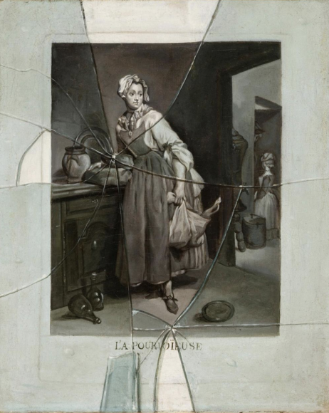
Etienne Moulinneuf’s clients, however, wanted the opposite. I looked twice, thrice, four times at what appeared to be a shabby Chardin print of a lonely market girl, framed behind a pane of broken glass, before I persuaded myself that it was a painting. By carefully creating the illusion of broken glass, Moulinneuf was expanding the poverty of Chardin’s narrative.
Playing these kinds of games with reality led art down bizarre pathways. The great printmaker Hendrik Goltzius was so renowned for his prints that when he turned to painting, in a huge Bacchus and Venus borrowed from the Hermitage, he set about making it look exactly like a giant engraving. Every tiny engraved line in this whopping print has been carefully painted.
The invention of photography introduced a fresh set of optical issues. The first photographs were black and white, and photography’s first speciality was portraiture. So those portrait painters who wished to take on photography — Célestin Joseph Blanc being the most determined warrior — began producing portraits that look exactly like black-and-white photographs.
Only when we reach modern times does this taste for trickery die down and a franker relationship begin to develop between art and monochromes. A room full of buzzing black-and-white abstractions has Bridget Riley in one corner and — sound the trumpets of celebration — nothing less than Kazimir Malevich’s notorious Black Square on a white background looming up in the centre. It’s a sight I never thought I’d see: the daddy of all abstractions at the National Gallery.
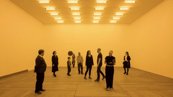
But the show saves its wildest turn-up for its final room. Having softened us up with assorted shenanigans in black and white, the journey suddenly opens onto an installation by Olafur Eliasson so brightly and remorselessly yellow that I do not recall ever being made as actively aware of a single colour. You walk into the limitless yellow, and you gasp. Because yellow, too, is a monochrome.
It’s an astonishing ending to an astonishing show.
Monochrome, National Gallery, WC2, until Feb 18