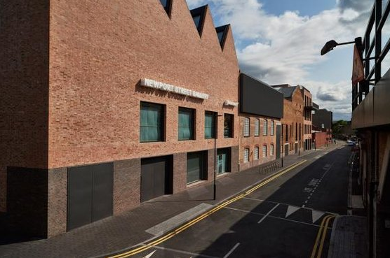
London has a new gallery. And it is huge. The size of a railway station. Coming down Newport Street, in Vauxhall, I was astonished to see where it started and, then, where it finished. There are running distances in the Olympics shorter than the frontage of the Newport Street Gallery.
So the first thing to note about Damien Hirst’s new venture is that it is characteristically high on ambition. The second thing to note is its location. Vauxhall offers many enticements, but a popular artistic destination it is not. Not in recent times, at least. Hurrying a mite nervously past the murky railway arches lining the other side of the road, I found myself wondering how many episodes of Minder had been filmed in them. Dennis Waterman? Second arch on the left, mate.
The third thing to note is that the building in which the gallery is housed has a colourful past. Before Hirst got his hands on it and spent £25m of his own money on a beautiful transformation, it was a scenery painting studio in which West End theatres had props made. That bit on the right, mate, that used to be a barrow-making workshop supplying London’s flower sellers.
All this is interesting and good. Ambitious building. Hungry location. Fertile urban mood. So it is with genuine pleasure that I can assure you of the quality of the opening show, devoted to the undervalued British painter John Hoyland (1934-2011). In the words of Dennis Waterman, abstracted a tad: “This Hoyland geezer, he couldn’t ’alf paint.” Yes, he could. His art smacks you right between the mince pies.
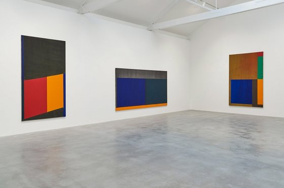
Inside the converted scenery studio, Hirst’s architects, Caruso St John, who recently completed the renovation of Tate Britain, have created a suite of six lofty galleries that feel immediately perfect for art. They are almost white cubes, but the occasional eccentric wall line surviving from theatre days sends them on a surprising diagonal here and there: white rhomboids. It’s roomy, monastic, glowing, and I am 99% certain that Hoyland, in his long career, never showed his work in a set of spaces better suited to it than these.
Hoyland was that uncomplicated creature, a painter of big abstracts. The great advantage that abstract painting has over other genres of art, particularly over the ones favoured in recent times, is that it requires no great thinking about or conceptualisation. An abstract painting is what it is. No gender issues. No identity politics. No mental double bluffs. No endless archival torrent. No sitting in a dark room for three hours waiting for the film to end. This is art stripped down to its visual basics. You look at it. You like it. Or not. Given the twaddle you have to sit through these days to secure the tiniest gram of visual joy, seeing the basics fronted up like this is a relief.
The show, drawn entirely from Hirst’s own collection, savours Hoyland’s work from 1963 to 1983 and is arranged in a basic chronology. The opening room had me twitching with pleasure. It’s so beautiful. Dominated by Geoff Hurst reds, set off with Wembley greens, these football-pitch-sized paintings from 1963-66 seemed somehow to remember winning the World Cup. Imagine if the Wembley pitch was red and Geoff Hurst was green. They are supposed to have been painted with newfangled, quick-drying acrylics, but your eyes recognise the reds immediately. Those aren’t acrylics. Those are the ground down essences of swinging London: buses, postboxes and telephone kiosks.
The influence of American abstract expressionism, and especially of Barnett Newman and his celebrated “zip” paintings, is also impossible to miss. Hoyland, 30 years old, young enough to be buzzing, old enough to know a good influence when he encounters one, has expanded the “zip” idea into L-shapes and lily pads. The essential combination of a large area of colour, set off by small patches of its chromatic opposite, is continued. But the chromatic opposites are no longer arranged in zips heading north to south, as they do in Newman’s art, tidily dividing up the picture. In Hoyland’s versions, they travel left to right as well, or overflow their outlines to form flooded patches.

While the opening room is dominated by reds, the next is devoted to green. Four big widescreens, impeccably installed by Hirst himself, hang sparsely on the white walls like modernist spaces glimpsed through a window. All four were painted in 1966. Where the earlier red paintings were mostly about colour, these green ones seem interested in light as well. The glowing green rectangles have a transparency to them that reminded me — and this was a surprise — of James Turrell’s light installations.
It’s an impression continued in the third and final downstairs gallery, where the unexpected arrival of some monumental grey blocks under an expanse of red nudges Hoyland’s abstraction into an architectural mood. And it is not any old architecture that is being distantly evoked, but, specifically, the concrete minimalism of the brutalists. Imagine if the National Theatre was a painting. Imagine if the grey light of London was playing on its concrete blocks. That’s the mood.
So far, so wonderful. The downstairs spaces at Hirst’s new venture, and the fine selection of Hoylands hanging in them, offer some of the purest joys I have recently experienced in a gallery. And it’s more than that. It’s a reminder as well that this is what art is supposed to do. Art is supposed to knock you out visually. The thinking, the conceptualising, the gender issues, the identity politics — those should be extras, not essences.
At the end of the opening galleries, an eccentric spiral staircase leads you upstairs to three more rooms where the quality of Hoyland’s work grows more variable. Whether it was the drink — of which he was dramatically fond, as I know from personal experience — or merely a growing compulsion to experiment, I can’t say, but the perfect touches of the work below begin to fidget and wobble.
Unfamiliar colours replace the vivid vermilions and greens. In every picture, more is now happening. Over here, a rectangle of blue has been smoothed flat with a palette knife. Over there, a forest of charcoal blacks is roughed out on bare canvas. Blobs appear, squirted casually from the tube. More and more pictorial accidents are welcomed onto the canvas.
This sense of adventure gets its most surprising reward in 1971, in a set of pictures whose colours seem to have been borrowed from the pantyhose counter at Marks & Spencer. Beige, flesh tone, powder pink, African violet: these absurd colours are splattered on and flattened in a display of aesthetic risk-taking that, judging by the dates, lasted only a month. I can see why he was embarrassed by them, and stopped. Time, though, has been kind to Hoyland’s pantyhose era, and it now forms a brave oasis of pink in a career devoted chiefly to more macho effects.
John Hoyland, Newport Street Gallery, London SE11, from Thu until Apr 3