Recently I have been reading the type-written memoirs of Shaun Greenhalgh, the so-called Bolton Forger, who was imprisoned in 2007 for producing fake works of art that were sold to various museums. Written in prison, the memoirs are packed with riveting information about how the fakes were created. They are particularly revealing in the field of graphic art. Greenhalgh made his own paper, his own ink, his own watermarks. He learnt to draw like Degas, like Lowry, like Leonardo. He mastered every technique. Except one: silverpoint. He couldn’t do silverpoint. It was too difficult, he says, and required too much expert subtlety.
To see why Greenhalgh avoided silverpoint, enjoy the first three walls of Drawing in Silver and Gold, at the British Museum, and by all means look at the fourth wall, too. The show seeks to tell the story of silverpoint “from Leonardo to Jasper Johns”. It begins with the Renaissance and ends with the here and now. The fourth wall, the contemporary one, is where it gets unconvincing.
Silverpoint — or, more accurately, metalpoint — is a way of drawing that involves preparing the surface of a sheet of paper with a gritty undercoat, then rubbing a metal stylus across it. The gritty undercoat shears tiny layers off the surface of the metal, leaving behind smudges and lines. I’ve made it sound agricultural. It isn’t. The preferred metal was silver, although gold was also used, and only true experts could handle the subtle wisps and flickers, and create convincing imagery with them. The best silverpoints look as if they were drawn with cobwebs.
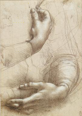
The BM show sets out its agenda with an immediate pairing of Leonardo and Bruce Nauman. Old Master on the left. Contemporary conceptualist with a taste for dissonance on the right. Both of them have used silverpoint to draw some hands. Leonardo does it with extreme grace and subtlety as he records the protective clasping of a woman cradling her tummy. Is she pregnant? That would make her a study for the Virgin Mary.
Nauman, meanwhile, who may as well be drawing with a Biro, gives us a set of scrawly, disembodied hands, acting out a crude illusion involving the suspension of a disembodied knuckle between two fingers. It’s a drawing that exploits none of silverpoint’s inherent characteristics, except, perhaps, its scratchiness.
So the old guys were good at it and the new guys are not. ’Twas ever thus. The show’s opening collection treats us to a beautiful sample of silverpoints produced in Italy during the Renaissance. A shockingly sexy Bacchus by Raffaellino del Garbo turns out, amazingly, to be a preparatory drawing for the resurrected Christ in a celebrated altarpiece in Venice. But it’s Leonardo who seems especially in tune with the subtleties of the medium. You don’t really see it in his famous image of the stern warrior in the curly armour. Look instead at how the bodies are described in the tiny adjacent study of two standing nudes. It’s all done with shadows. It’s brilliant.
The display doesn’t explicitly address the question of silverpoint’s advantages over other media — why any artist would choose it over, say, pen and ink — but on this evidence it seems almost to constitute an exquisite talent test. Only the greatest could do it really well.
Dürer, of course, was a master of delicate realism, and the German wall is among the highlights here. Where the Italians of the Renaissance risked silverpoint only in the studio, the cocky Dürer seems to have kept a casual pad of it in his pocket as he toured Europe broadcasting his fame. There’s a dramatic aerial view of the cathedral in Aachen, drawn in 1520. And a resting dog, some sort of greyhound, whose many textures are made miraculously tangible with the whispery ant-marks of silverpoint. That’s how you draw fur.
Silver, duh, is innately silvery. It doesn’t do deep blacks or thunderous scrawlings. It works in greyscale, with petite suggestions and tiny changes in tone. This gives it a special sensitivity to light. Not big light. Not the sun flooding in through a window at high summer. But tiny light, the modest light of the everyday, the kind of light you would dismiss as nondescript if a genius like Leonardo or Dürer had not captured it for you and revealed its delicate effects with silverpoint.
The single most impressive display of the method in this gathering is by Rogier van der Weyden, the universally acclaimed but curiously underexamined giant of the Belgian Renaissance. Van der Weyden is up there with the Leonardos and the Dürers in the talent stakes, but there’s little by him in Britain, and he’s easy to ignore. Here, he shows us a woman’s head, framed by a wimple of crisp white linen. The contours and hollows of her lovely face are one kind of miracle. The folds and shadowings of her wimple are another.
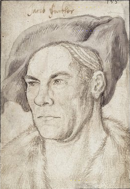
Hans Holbein the Elder, father of our Holbein, the Holbein of Henry VIII, turns out to have been a master metalpointer. His portrait of the banker Jacob Fugger strikes a rare note of steeliness in a generally gentle display. It’s Fugger’s eyes that do it: the thuggish cast of his sternness. Remind me never to borrow any money from this guy.
All this is impressive. The Italian, Belgian and German walls of the show make out a fascinating case for silverpoint and its nuances. They prove, too, how difficult it must have been to control and excel at. So it is no surprise to find that by the middle of the 17th century, it had fallen out of favour. One thing it definitely was not was a quick medium. Its gentle whisperings, you sense, were innately out of tune with the bellowings of the baroque. So for 300 years, artists stopped using it.
Its revival in the 19th century, and the story that follows, give us the show’s fourth and least impressive wall. The first returnees to silverpoint’s pale pleasures were the German Nazarenes, precursors of our own pre-Raphaelites, whose deliberate redeployment of early Renaissance techniques was little more than a shortcut to the past. William Dyce’s Madonna and Child, dressed for 1488, drawn in 1848, is a particularly cloying example. Holman Hunt, Alphonse Legros, Joseph Southall searched merely for a generalised late Victorian sweetness.
Among more recent silverpointers, only Otto Dix appears genuinely taken by the peculiarities of the medium. His view of the Jewish Cemetery at Randegg is so floaty and insubstantial, it feels as if it is deliberately trying to evoke the fragility of the Jewish presence in Germany in 1934.
As for Jasper Johns, his one and only silverpoint is an interior with a vase from 1984, whose overtly minimalist look could have been achieved just as successfully with a 4H pencil. What an insensitive stab at sensitivity.
Drawings in Silver and Gold, British Museum, London WC1, until Dec 6