It’s hard to think of a material less likely to produce great art than DayGlo paint. A Freudian regurgitation of my personal responses caused the following words to tumble out: adolescent, skateboards, felt-tips, acne, commix, high school, New York. That’s what DayGlo paint means to me. So it doesn’t bode well. And the fact that Peter Halley uses, and has always used, DayGlo colours ought to mean his art is ghastly. But it isn’t. It’s actually very beautiful. The selection of his new paintings that has opened at the Waddington Custot Galleries is one of my shows of the year so far.
Halley, who really is from New York, emerged in the 1980s as part of a briefly interesting American art movement called neo-geo. Jeff Koons was another member. So were Ashley Bickerton and Haim Steinbach. The neo-geoists claimed to be taking a pop at corporate America by using its own language of design as their weapon. Thus, Bickerton would smother his sculptures with sponsorship logos — imagine the helmet of a racing driver — not because he admired the sponsoring companies, but to satirise their ubiquitous corporate presence. In the same spirit, Halley, the most neo-geoish of the neo-geoists, insisted that we see his hard-edged DayGlo abstractions as diagrammatic evocations of corporate America. What seem to be faceless squares, grids and channels are actually abstract representations of what we hippies had previously called “the system”: the circuit boards of power connecting the companies and influences that run the modern world.
All this trendy social politicking was, of course, hugely off-putting. It reeked of evening classes and Foucault for beginners. Whenever I went to a Peter Halley show, I just wanted to turn off the words and look at the pictures. Because, somehow, despite the poststructuralist guff and the situationist twaddle, despite the DayGlo colours and the overly ironic use of Roll-A-Tex, he seemed actually to be producing some unusually compelling abstract art. Somewhere in there, hiding behind the huge stacks of defensive poststructuralist text, was an inventive image-maker with excellent pictorial instincts.
The new show is a huge return to form. Somewhere between the 1980s and now, Halley got bogged down in his own complication. His pictures grew too busy and bitty. The new collection features a return to simpler images with more monumentality about them and less diagrammatic confusion. All of the 13 pictures on show here are good. Three of them qualify as Halley masterpieces.
The first of these is called Glee and takes its name, I read, from the popular postadolescent TV series about a gang of high-school students whose education, I seem to remember, consists chiefly of singing and resinging Don’t Stop Believin’, by Journey. Halley always says the titles of his pictures are largely accidental — the ones in this show are taken from a list of American TV series found in a catalogue. But they seem usually to hint at a particular direction and to take on the duties of a mood chart.

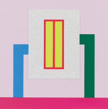
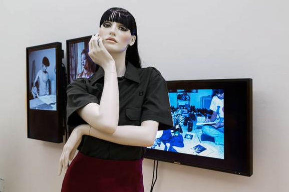
Model behaviour: 2000 Wasted Years, by the Bernadette Corporation (Mark Blower)Glee is a good example. Most of the painting is pink. At the bottom, it’s a mature and solid pink, the colour fashion designers always call fuchsia. I can imagine Mercedes out of Glee turning up at a prom in an evening dress of that colour. The other pink, the one that fills the picture’s background and functions as a kind of sky against which everything is set, is paler and more fugitive. Unusually in a Halley picture, it feels like one of nature’s colours and can almost be envisaged as a rosy sky at the end of a New York evening. Against this lovely and gentle pink, a suspended structure rises up. It’s a white box, held in place by two angular supports, one green, one blue. In the middle of the white box, there’s a pair of red french windows with a yellow light shining through them. Or rather, it would be a pair of french windows if we didn’t know already that Halley has always called this shape “a cell”; and that what he actually has in mind is a prison, with bars in the window, and a controlling social role.
I have just used up an awful lot of space describing an image that actually feels rather spartan in the flesh. These are simple, Stonehenge proportions: a looming shape against an empty sky. Nothing sinister has survived from the original diagrammatic intentions. Instead, the clever citing of Glee tugs your responses towards an innocent teenage mood, underpinned by a note of tristesse. Something is over. Only the echoes remain. What a gorgeous rosy pink that is.
So that’s how it all works. Halley offers up his carefully composed urban abstractions, and the viewer’s imagination bounds about making the connections. What is noticeable here is that Halley has turned down the levels on his DayGlo colours and entered into a more nuanced and poetic phase. It had to happen. He’s 60 this year and could hardly have spent the rest of his life painting like a skateboarder. At some point, some obvious signs of maturity had to emerge.
The show’s second masterpiece might almost pass for a Rothko — if you filled the room with fog. Once again the title is telling. Supernatural is black, deep blue, purple and cranberry red. This time there are no conduits or angular supports. The rectangles seem to hover in space with an austere and moody weightlessness. I love it.
The third masterpiece, Bang Goes the Theory, is as good a painting as Halley has ever produced. This time the colours have popped up into a more familiar brightness, with a big blue square set against a background of yellow and red. If you asked an impressionist who’d studied colour theory — someone like Pissarro — why everything here works so well, he’d tell you it’s because these particular reds, yellows and blues are primaries, while that green along the bottom is a complementary. Colorifically, it’s all simples. But what colour theory cannot tell you is why, in this arrangement, that central blue has somehow acquired such an intense and suggestive beauty. No amount of theory will ever explain that blue.
At the ICA, which appears finally to have rediscovered some zing and pertinence after a couple of decades of solid irrelevance, another critique of corporate America has been mounted by a sly artistic collective who call themselves the Bernadette Corporation. Founded in New York in 1993 by a gang of renegade fashion students, the BC, as the logo has it, have done most of their critiquing by infiltration. Thus, to critique the fashion world, they have put on fashion shows and designed ranges of clothing. To critique the film world, they have made films. To critique celebrity culture, they have employed celebrities, notably the part-time Bernadette Chloë Sevigny.
The results have been packaged for us as a travelling trade-fair display, with shiny corporate TVs showing noisy pseudo-corporate videos and lots of portentous vitrines filled exquisitely with subversive BC produce. It’s a texty and somewhat confusing experience. Only the most highly trained fashion eye will be able to discern much meaningful difference between the fashion being critiqued and the fashion doing the critiquing.
Indeed, I found myself liking the BC’s anti-mugs and anti-headscarves so much that I asked about buying some. But, of course, they are not for sale, because this is a show that is anti selling. That, finally, is the problem with infiltration as an agit-prop strategy. In its quest for authenticity, it achieves a compromising desirability that renders it useless.
